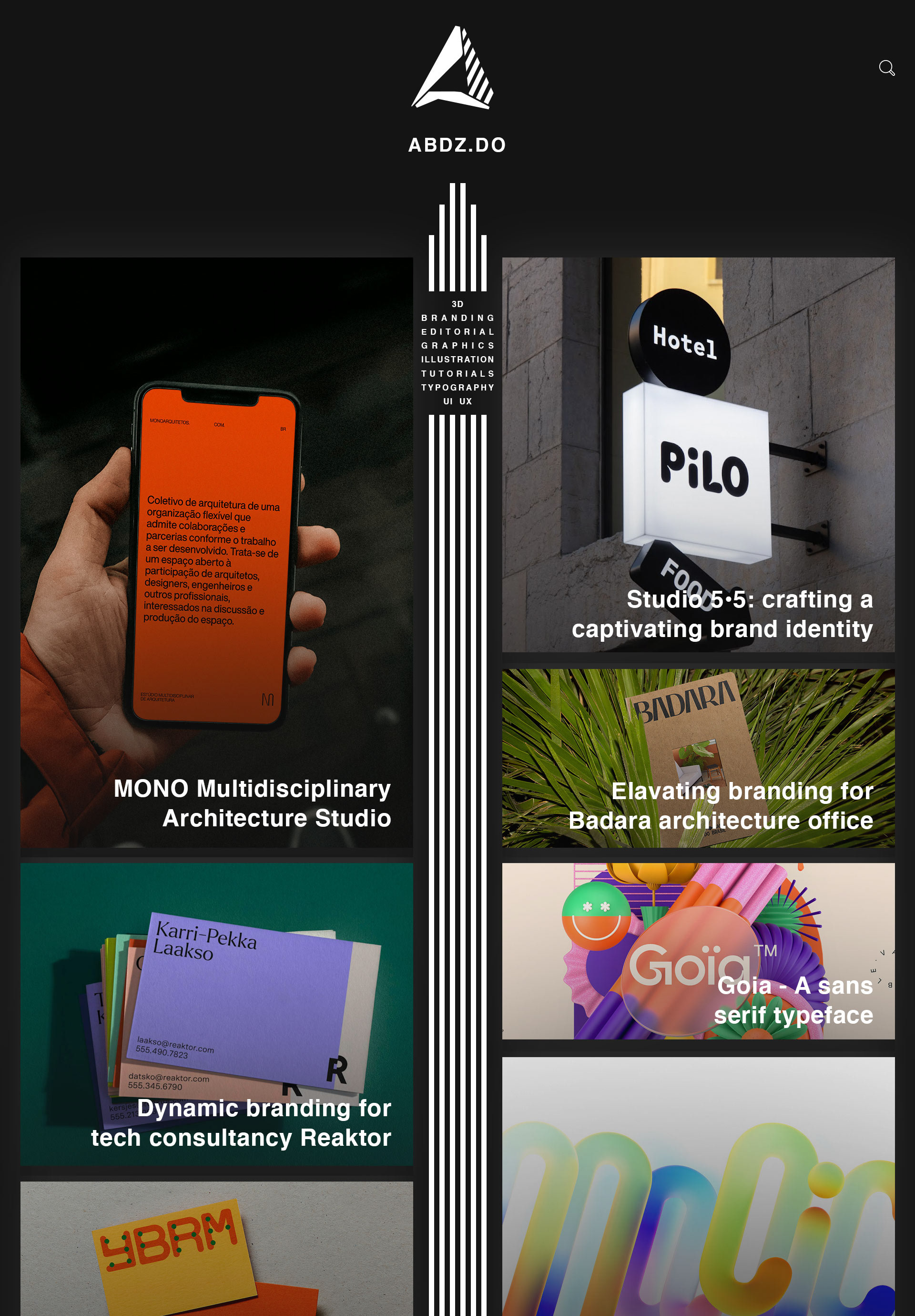
I've been a fan of the Abduzeedo design blog since around 2013 and that's allowed me to watch as the website has grown and developed. Once thing that's recently stood out to me is how unfriendly the UI can appear to be. The article headlines are confusingly placed and the adverts cause a dizzying effect as you try to navigate the blog. I decided to have a go at redesigning the website, while making sure to retain the essence of Abduzeedo.
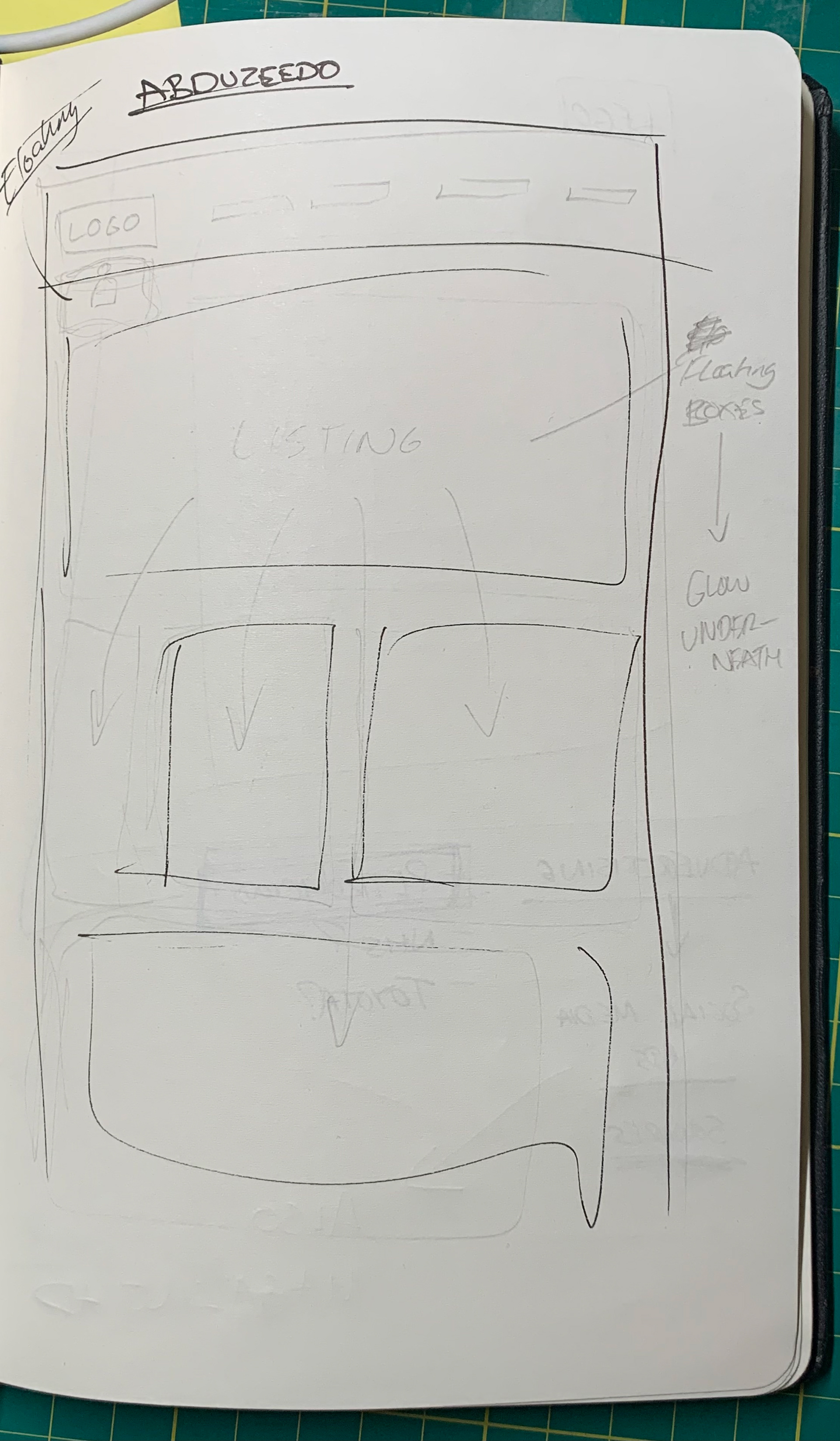
I wanted to completely redesign the main interface. To do this, I started by revisiting the previous logos. Once complete, I decided on this linear, narrow styling that allowed the eyes to be drawn to the centre of the website, creating a consistent direction throughout.
After this, I started looking at the font. As Abduzeedo is a design blog, I opted for a staple within the original design world; Helvetica. It felt right that a design blog have the basic fundamental design aspects to it, allowing the art and design featured in each article take the spotlight every time.
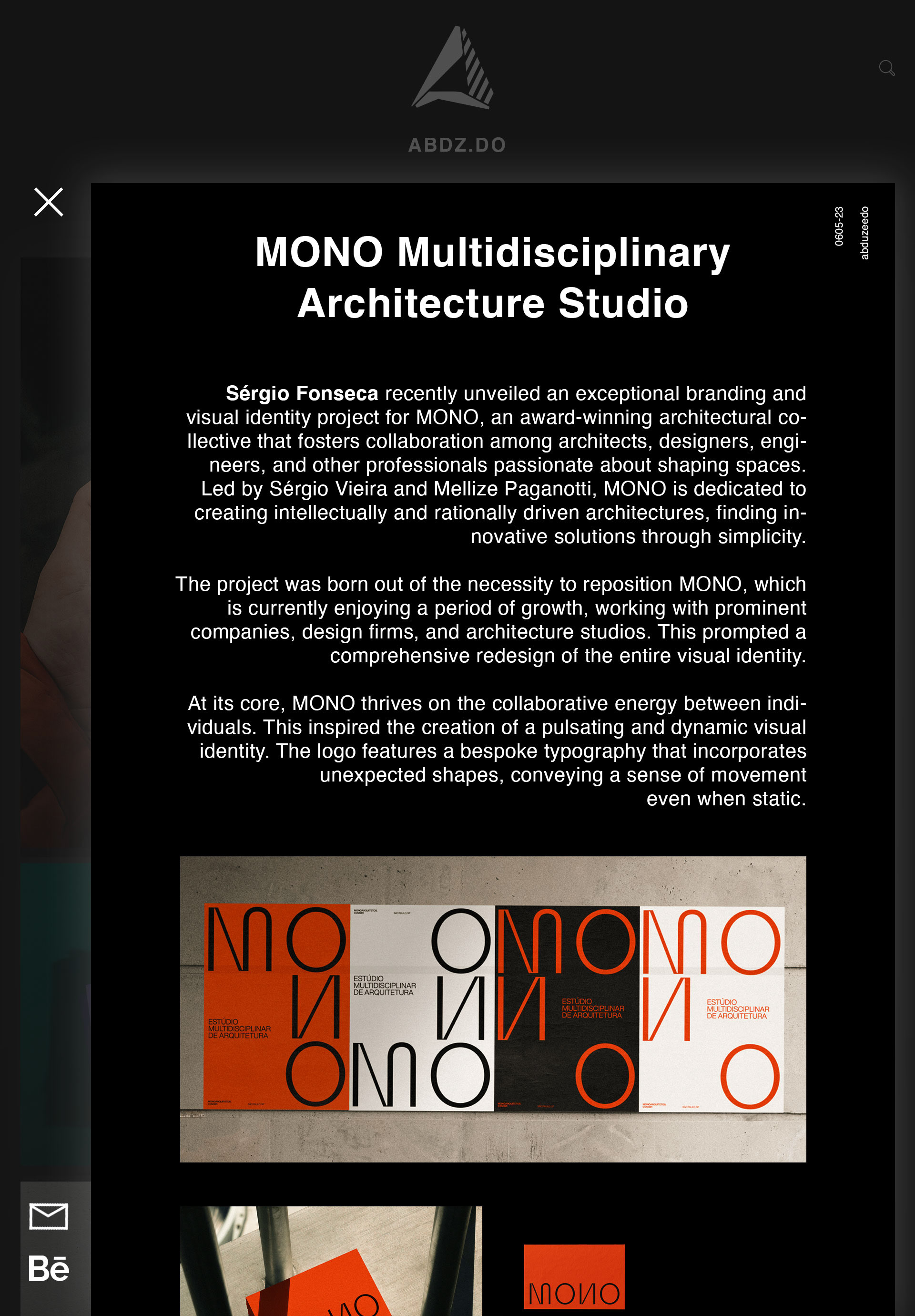
Similar to my Lego website case study, I opted for a floating design. The idea is to tap or click on an image, and the article appears above the homepage, giving the user a sense of depth. Leaving the page requires you to hit the 'x' on the top left. If you are interested in the article or the artist mentioned, you ca visit their Behance profile via the icon at the bottom left.
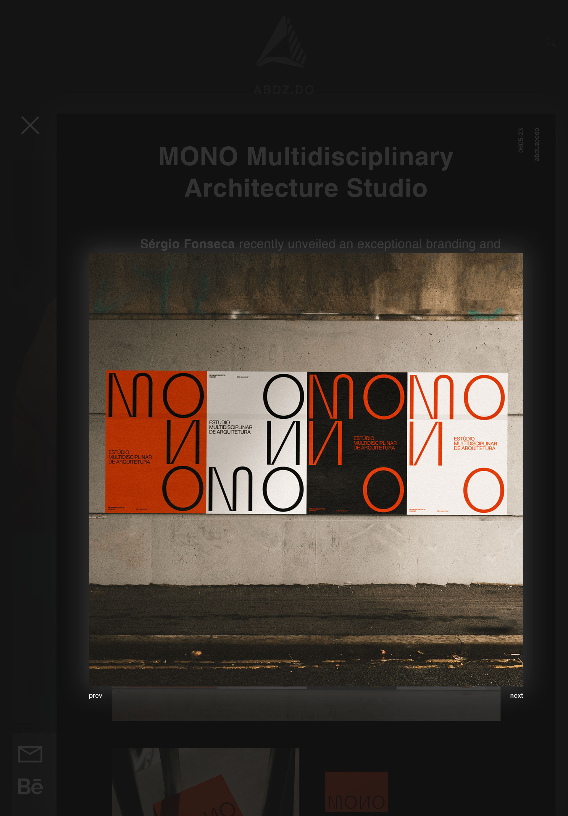
Continuing the floating idea, if you select a photo on the article, it appears above both the article and the homepage, causing the background to get darker and further away from you.
The logo design was something I really wanted to tackle. I started by looking at early logos and then decided to try combining them to create something new and fresh. Below you will also find a brand rule for the logo.
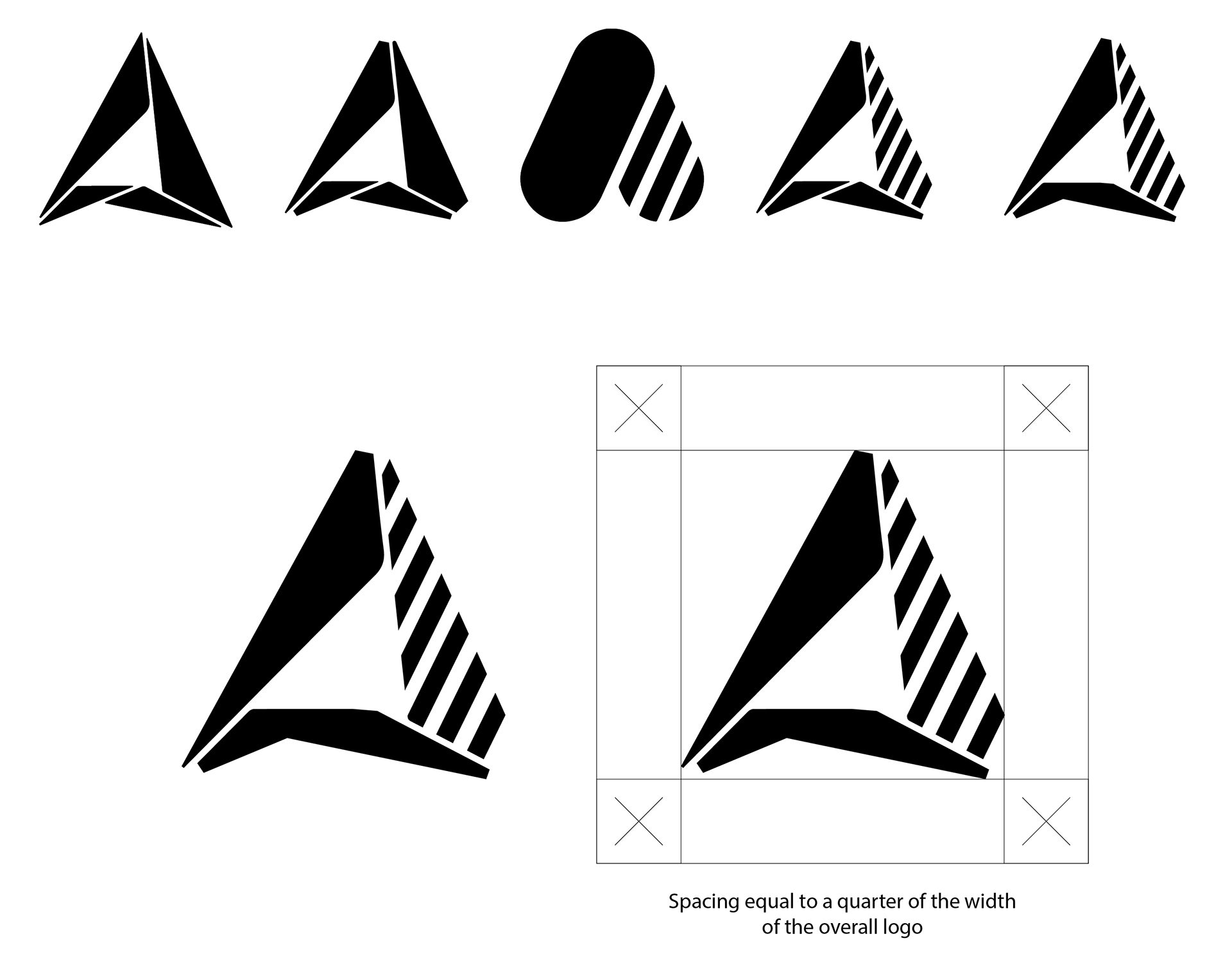
Below is a look at the quick sketch I made before starting the project.