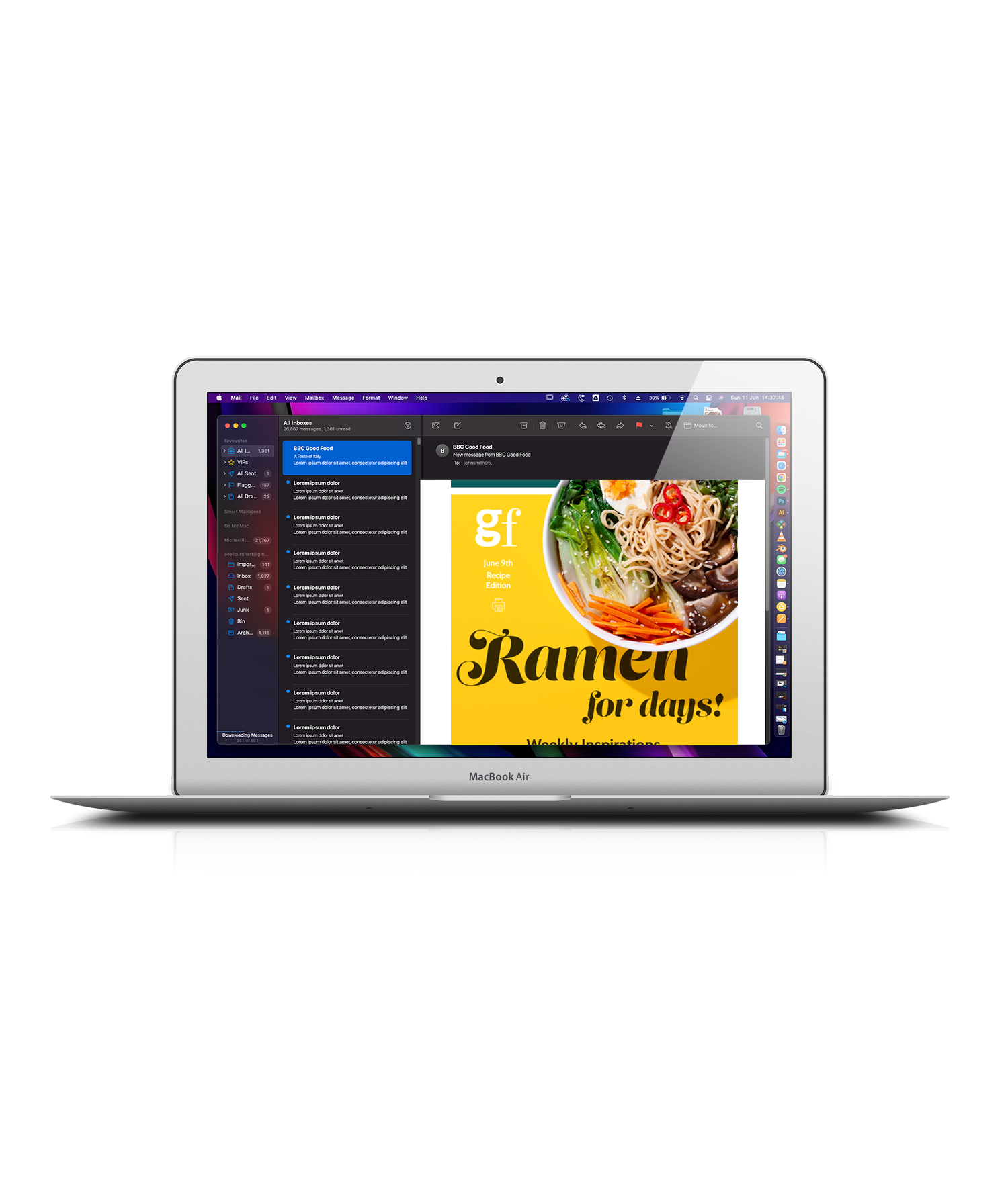
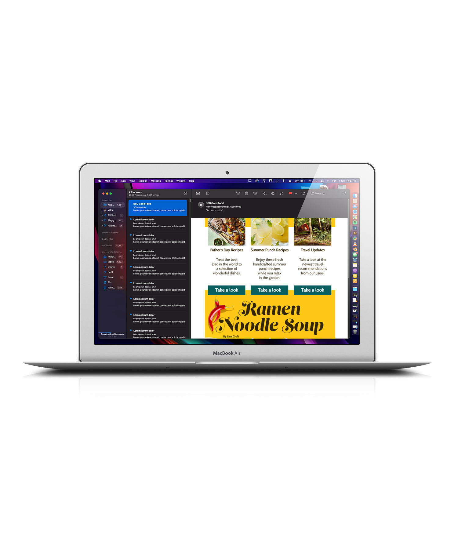
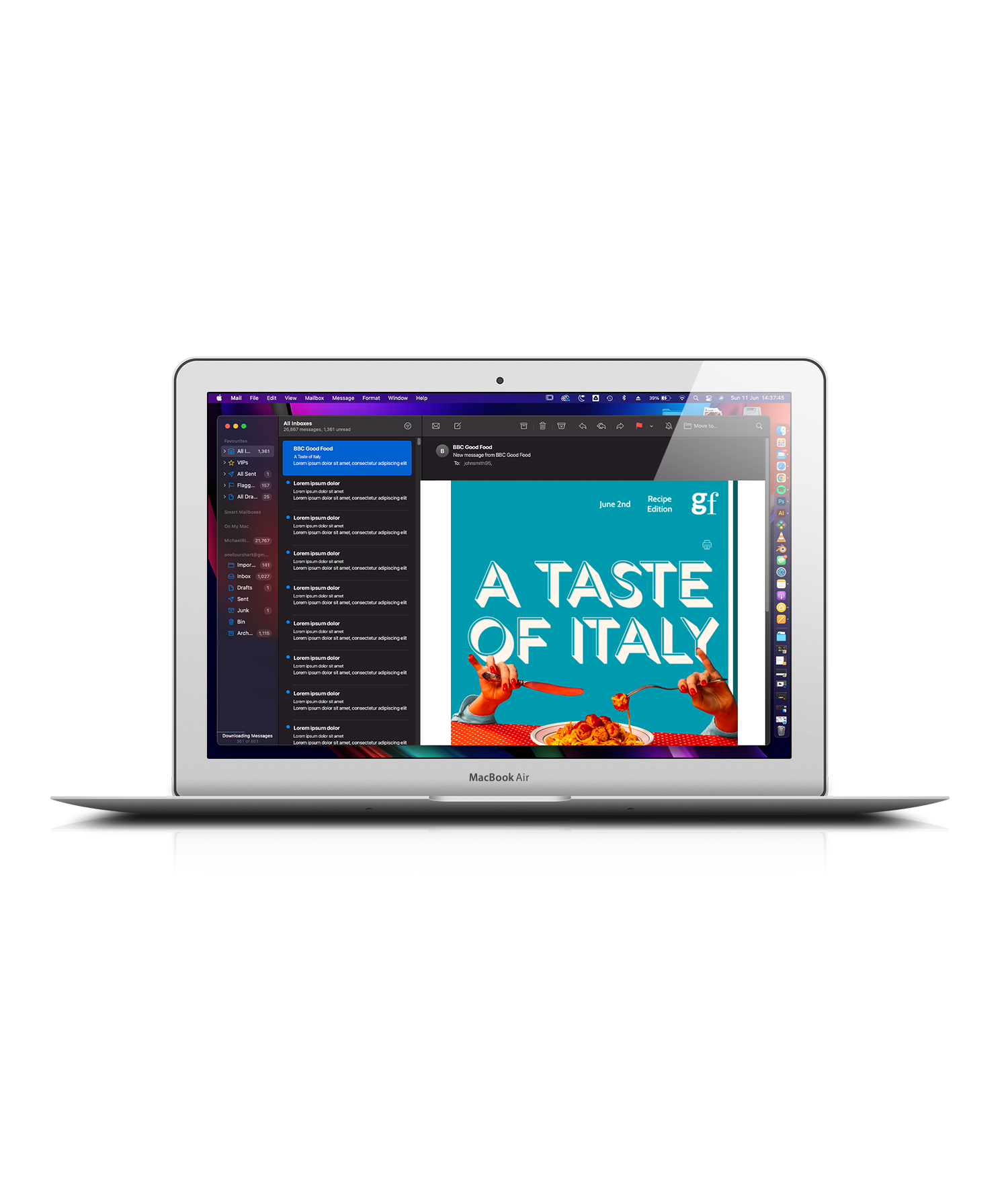
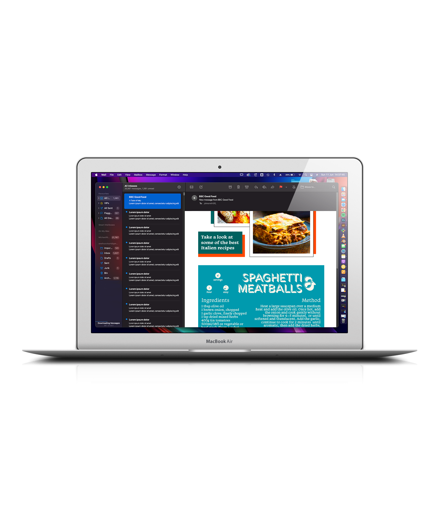
While my previous 2 case studies were based around updating a website of an already existing space, I wanted to take a quick look at updating the email/newsletter marketing presence of another existing space. Like most of us, I will go to a website like BBC Good Food to gather recipes and learn new tricks, but I've always felt like their website was bland (unlike the food) and the email newsletters were nothing special. So I had a go at changing this.
While keeping the idea of learning at the forefront, I went for a bright twist when making these. Having the newsletters structured in a way where you received updates about the weeks blog posts and then you received a main recipe that you can print off directly from the email.
I created 2 designs, both different takes on a similar idea, but while also focusing on a theme surrounding the main recipe. I also wanted to give each recipe a brand identity as such, so I looked at different font styles until I determined which ones worked with the recipe, and went from there.


Below are a series of email client mockups, along with gifs to help demonstrate realism for this design.
